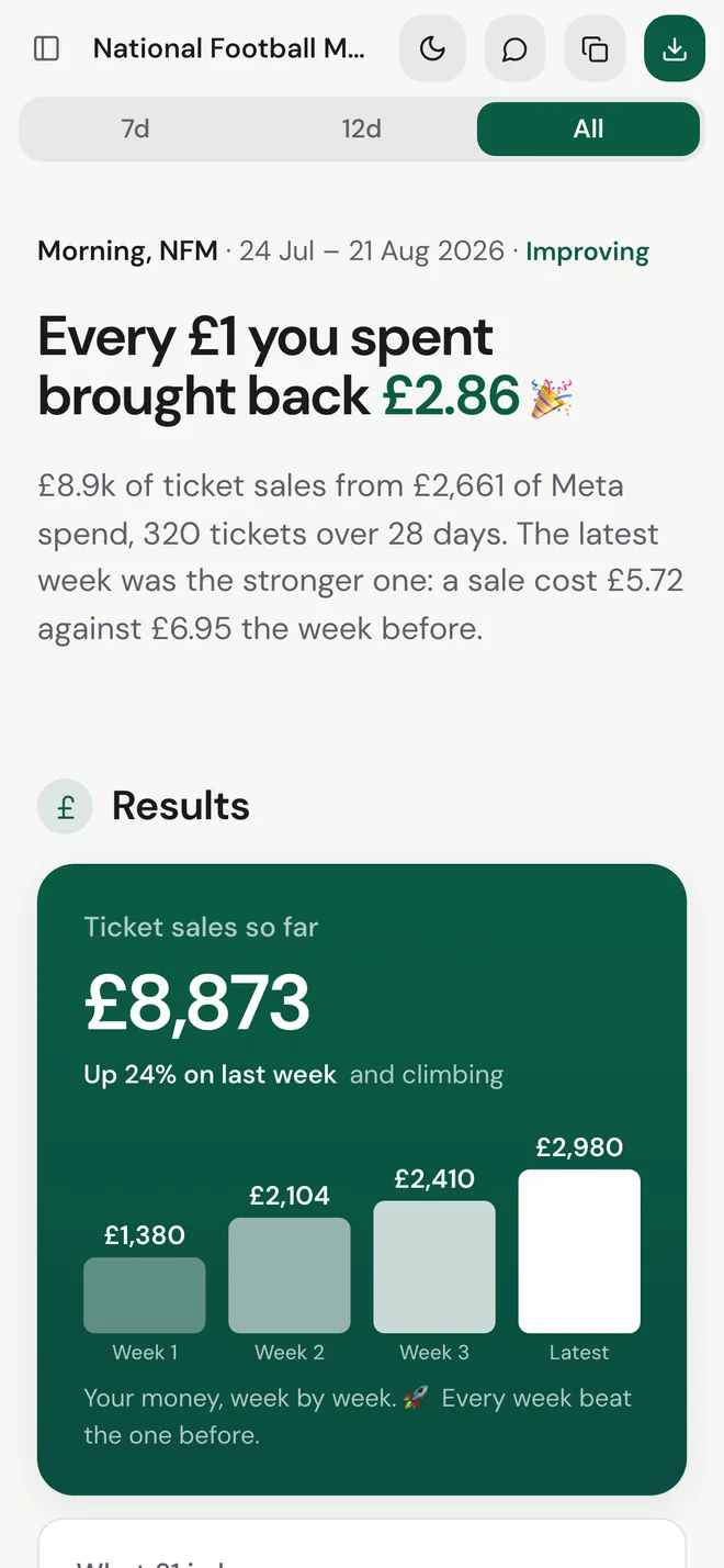
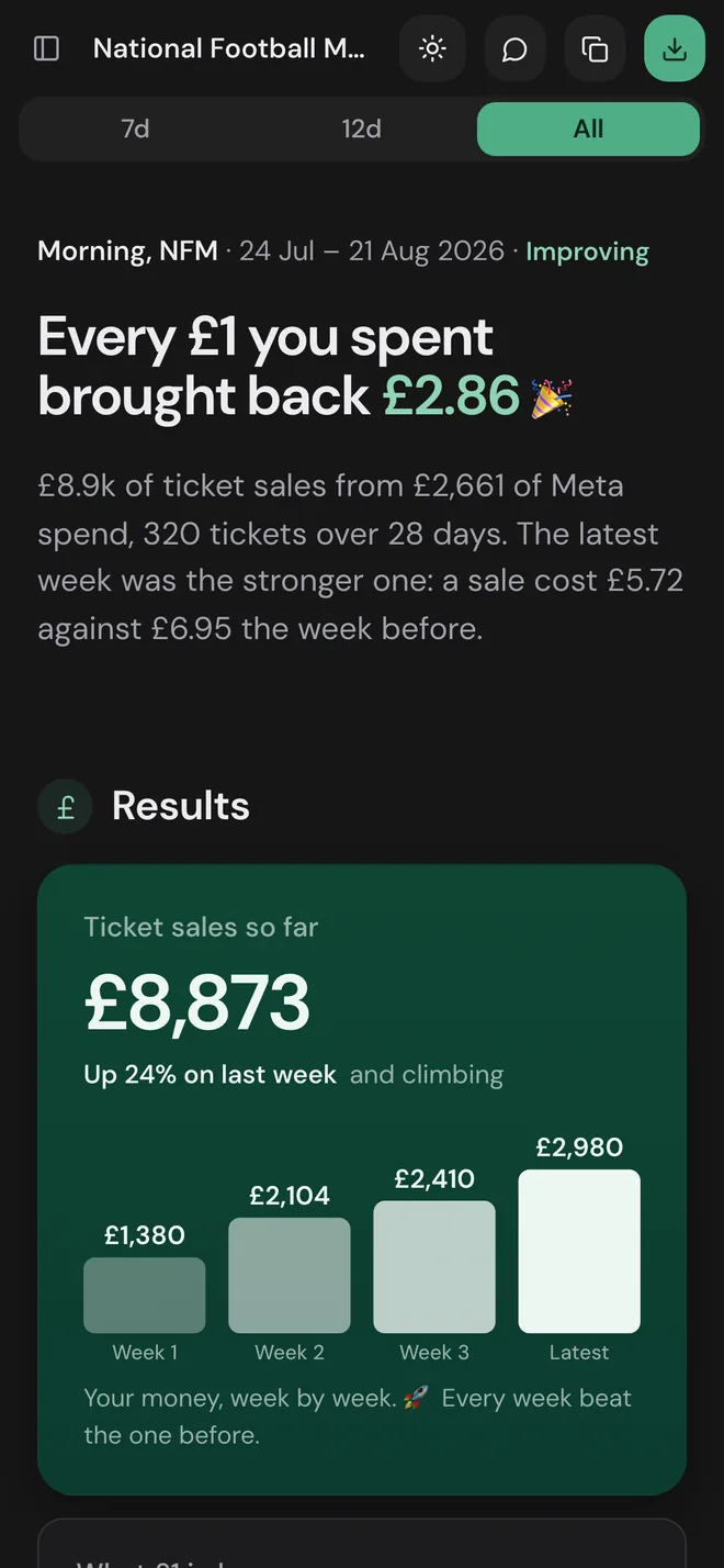
Paid media reporting that explains itself. I designed and built it at Influential, from a rough prototype to a pilot on a real client’s campaign.
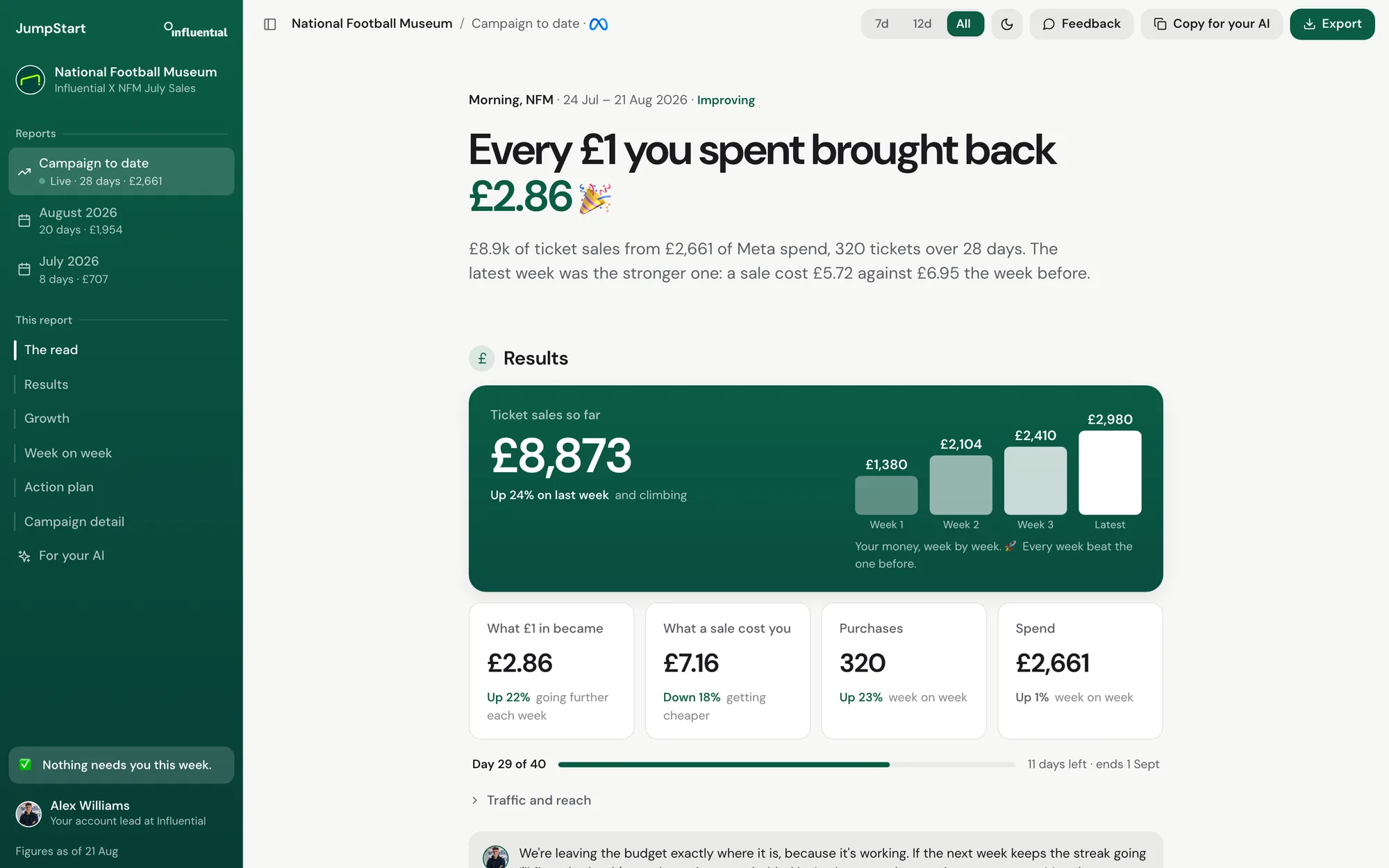
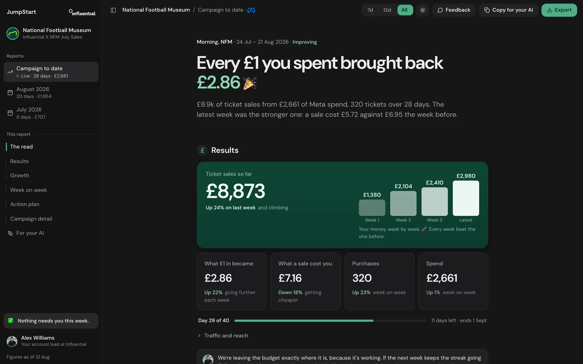
I’ve scaled the figures in the National Football Museum screens, so no real campaign numbers appear on this page.
The read
Clients don’t want a dashboard. They want to know someone good is watching their money. So every JumpStart report answers four questions: what changed, why it matters, what the agency is doing next, and whether you need to decide anything.
A reporting product for Influential’s paid media clients and the team that runs their accounts. Clients get a briefing in plain English. The agency runs every account from one desk, and any report can go out as a deck, a PDF, an A4 report or an email.
Everything from the audit on: research, product thinking, interface, tone of voice and the build. I designed in the browser and built with Claude Code and Codex, so James and Alex were always reviewing something they could click.
The National Football Museum pilot ran on live Meta data behind a client password until the campaign ended on 31 August. The agency desk is built behind a work sign-in and still runs on sample accounts. A public site is on the way.
From James’s prototype in June to the export dialog in September.
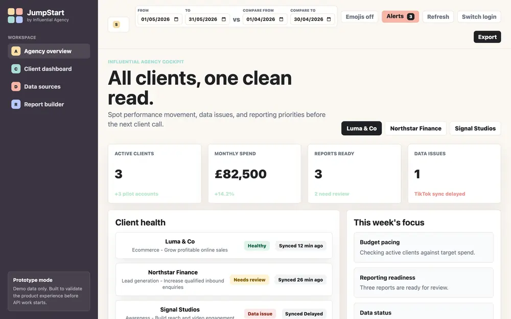
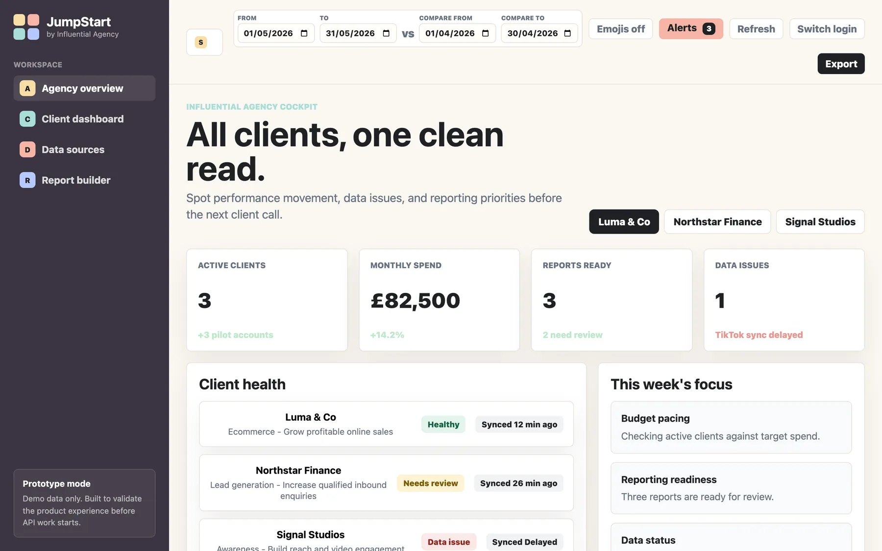
9 June
Where I started. An agency cockpit and a client portal.
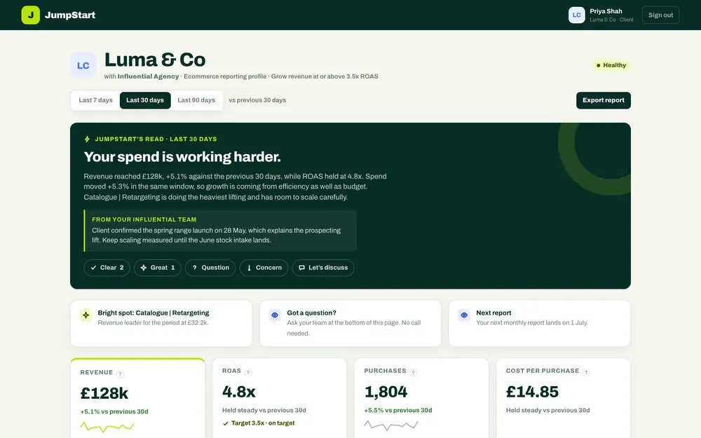
20 June
My first pass. A green identity and a trend chart you can explore.
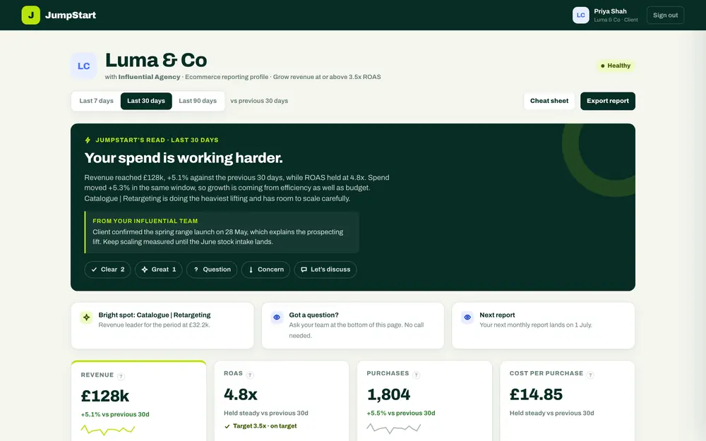
23 June
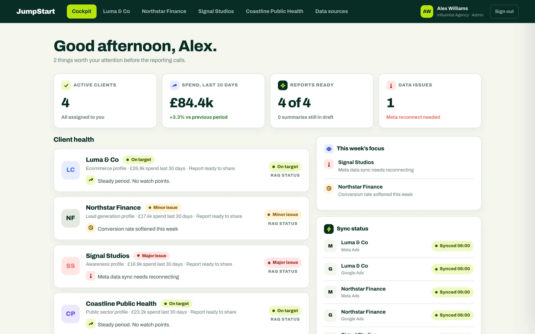
Everything the team asked for, on one screen.
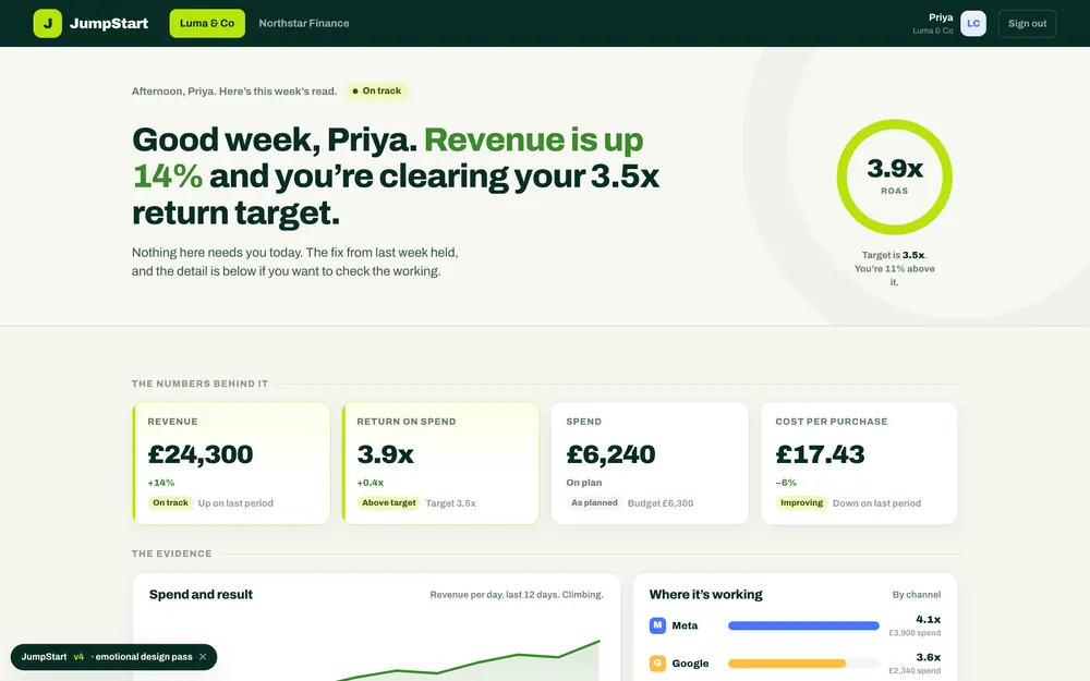
24 June
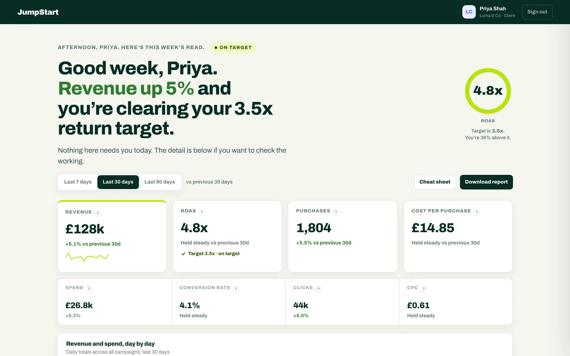
The read gets a voice. “Good week, Priya.”
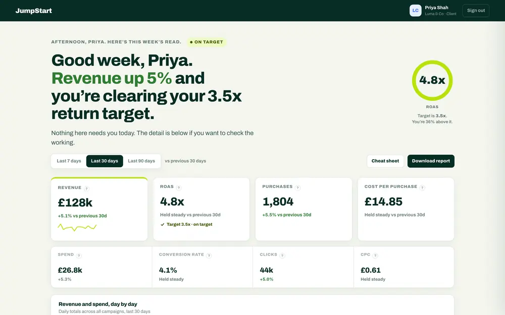
25 June
Signed off by James and Alex. It became the reference.
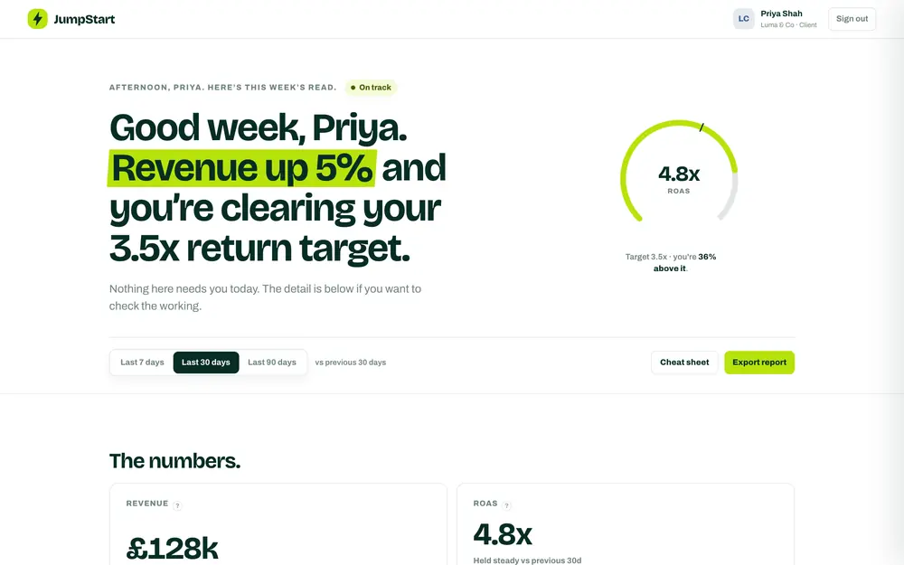
3 July
A white editorial version. Lovely, and no clearer.
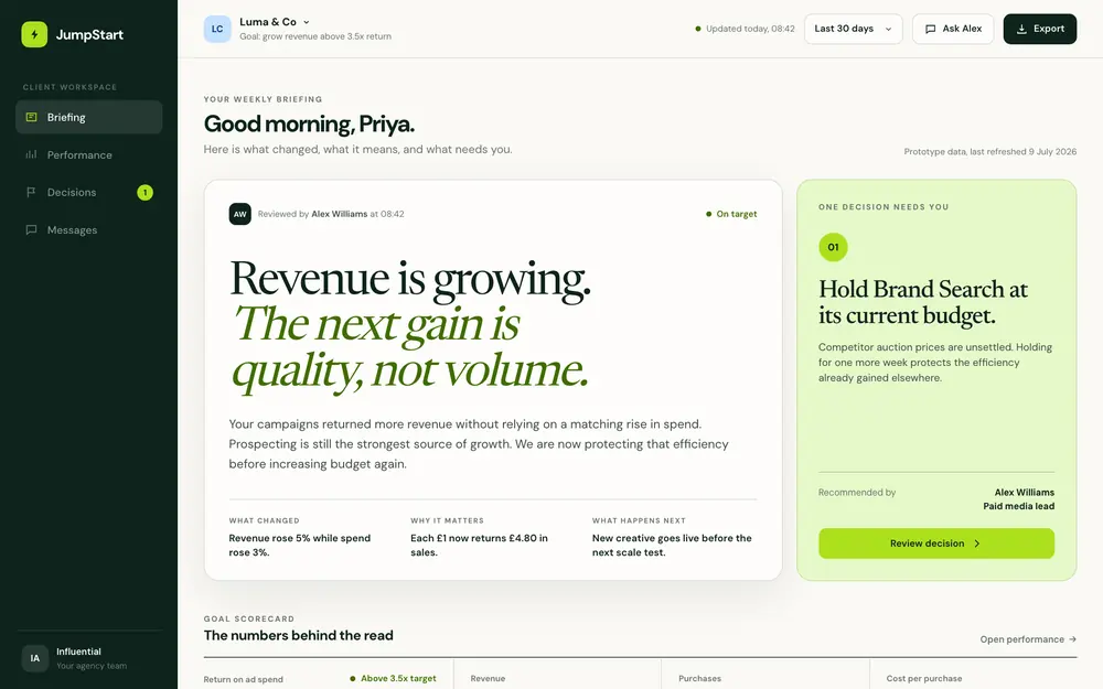
9 July
A morning briefing, with the numbers underneath.
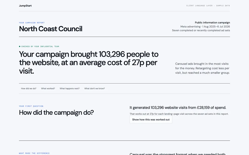
12 July
The client’s questions first, the maths behind them.
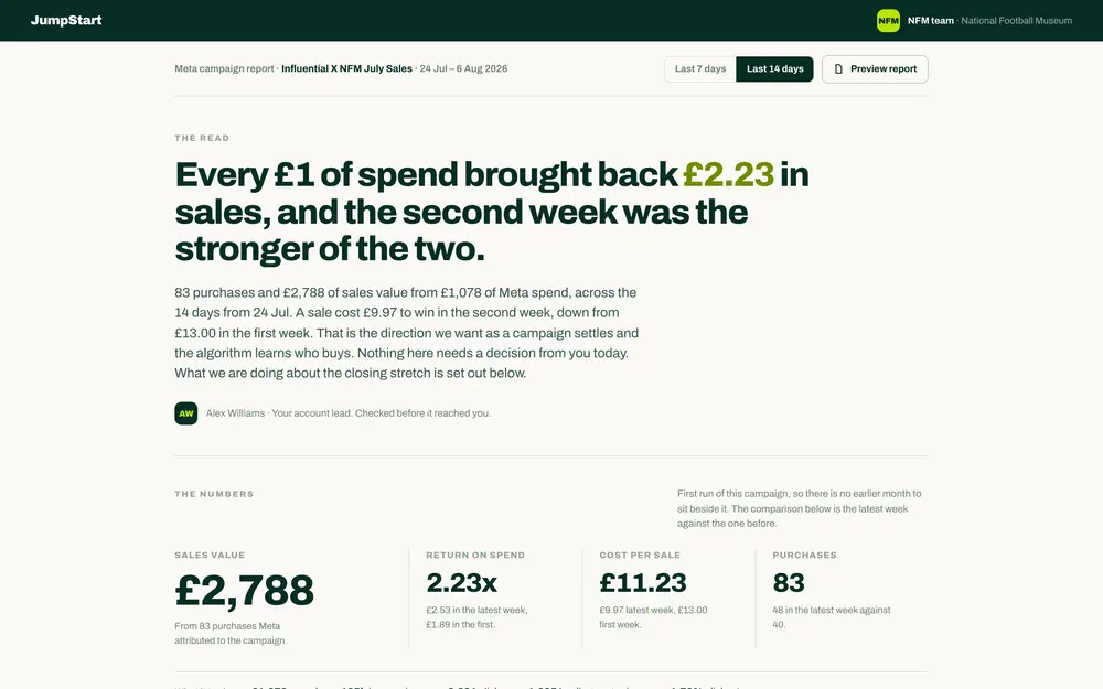
13 August
The National Football Museum, on live Meta data.
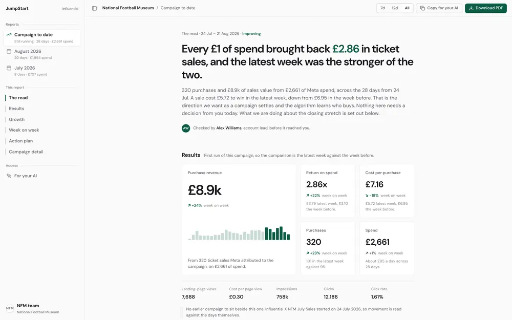
21 August
One verdict at the top, checked by a person.
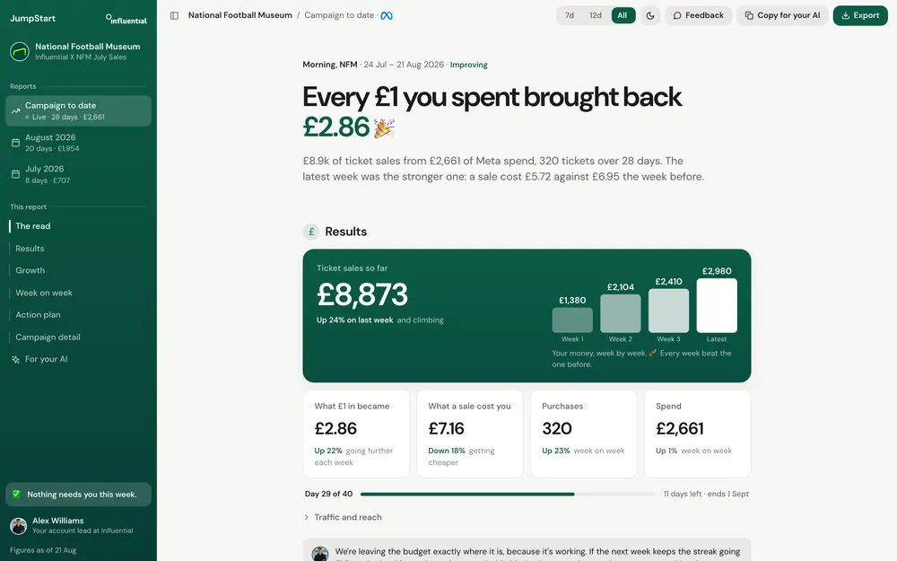
26 August
Personality where the news is good. This is what the client sees.
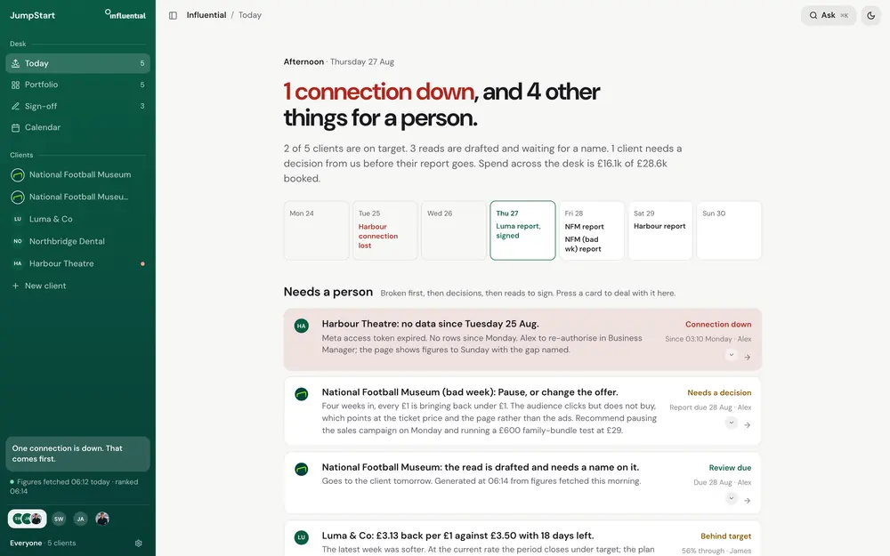
28 August
What needs a person, broken things first.
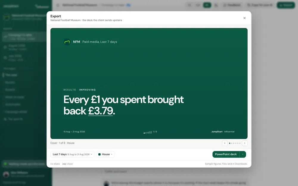
9 September
Any two dates, previewed before it goes.
9 June
James handed me a prototype and a name on 9 June. His pitch was paid media reporting with a friendlier front door. The tools agencies use felt clunky and heavy on data, and he wanted something closer to Monzo or Slack.
My audit said the instinct was right and the product was still a concept. The AI summary had nobody behind it. The client’s question box went nowhere. The login was a role picker. A second brief, drafted with AI, described client onboarding instead of reporting, so I went with what James had said in the room and made reporting the first job.
The insight that became the brief
The email was the product.
Every month an account lead would read the platform numbers, work out what happened and rewrite it as an email the client could use. The email was always better than the dashboard, because it had a verdict, a reason and a next step.
June
I went through the tools agencies already pay for, including Funnel, Supermetrics, AgencyAnalytics, Whatagraph, DashThis, Databox and Looker Studio. They’re strong on connectors, templates and scheduled reports. Every one of them assumes the reader already knows what CPA means.
The person reading a JumpStart report doesn’t. She’s a marketing lead with a budget to defend and a finance director who asks every month whether the ads are working. The night before that meeting she feels a small, familiar dread, because she can’t tell.
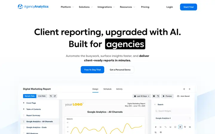
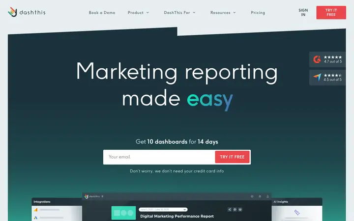
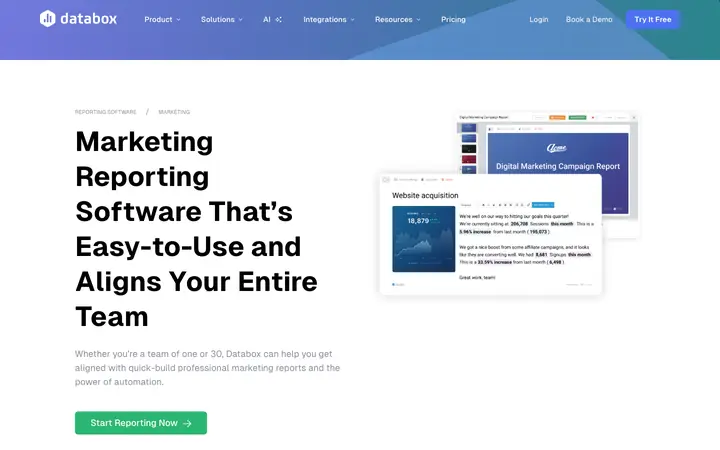

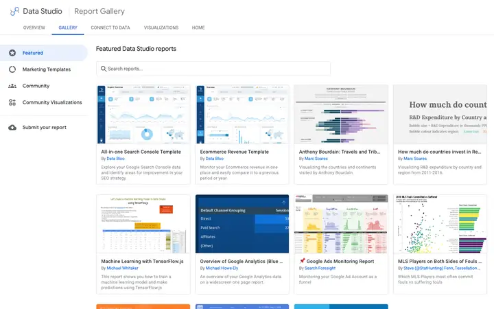
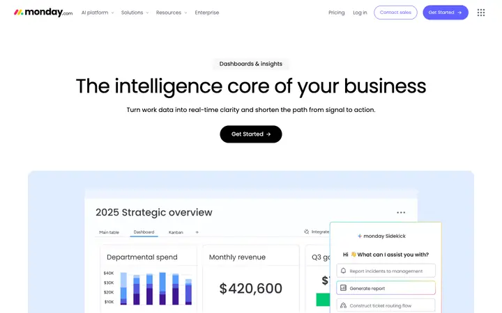
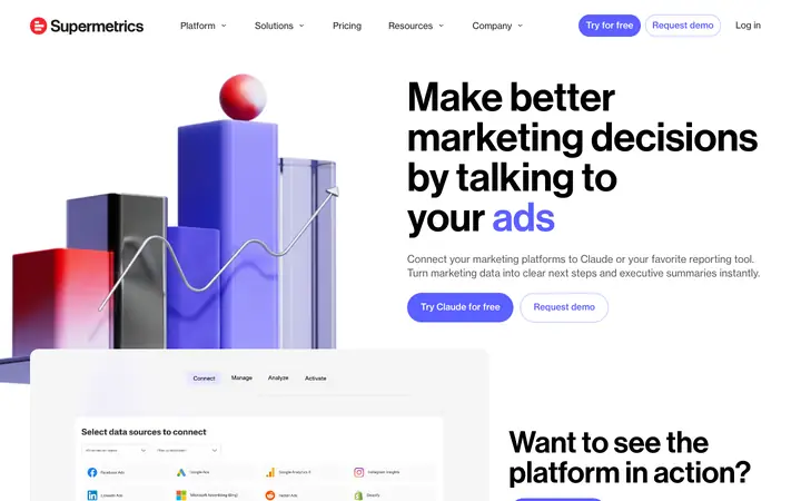
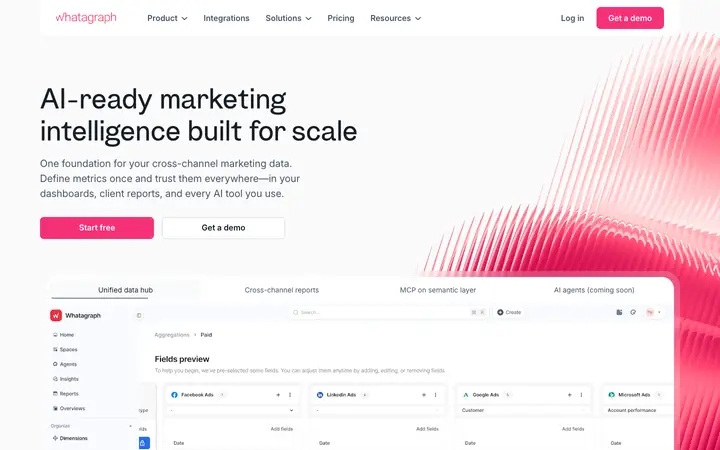
10 to 24 June
The early versions came quickly. By 20 June there was a working build with real sign-in and separate client views, plus a line of static prototypes I could change in minutes. Each version added what the team asked for: sign-off, a cheat sheet, benchmarks, a funnel, a channel comparison.
Then I looked at V3 and felt it was good-looking but soulless. That happens when you build before discovery has finished. So I went back to the start and ran the process properly. I set up three AI agents with one job each: a researcher for the client’s real worries, a designer for tone and feeling, and an editor for what to cut. Then I pulled what they found into one direction.
Six principles came out of it, and they still hold.
Every screen opens with a plain sentence, then the numbers that prove it.
“We noticed Tuesday, we acted Wednesday” does more for trust than a green number.
The more money at risk, the plainer the page. A bad number is never cute.
Personality lives at the top of the page and fades to nothing in the tables.
The first screen is a fixed length. New things go behind a click.
Each colour means one thing, and nothing else borrows it. Red is for broken.
Where the personality lives
Warm
A greeting, the verdict in one sentence, numbers that count up. This is where the voice lives.
Neutral
The trend, the comparison, what we’re doing next. Human, but tighter. Colour carries meaning here.
Silent
Campaign tables. A fast, quiet, normal dashboard. A finance lead should never have to fight the personality to read a figure.
25 June
V5 brought it together. The read sat at the top, a “needs you today” list held anything waiting for sign-off, client questions reached a real person, and the report exported to A4. James and Alex reviewed it on 25 June.
What the review changed
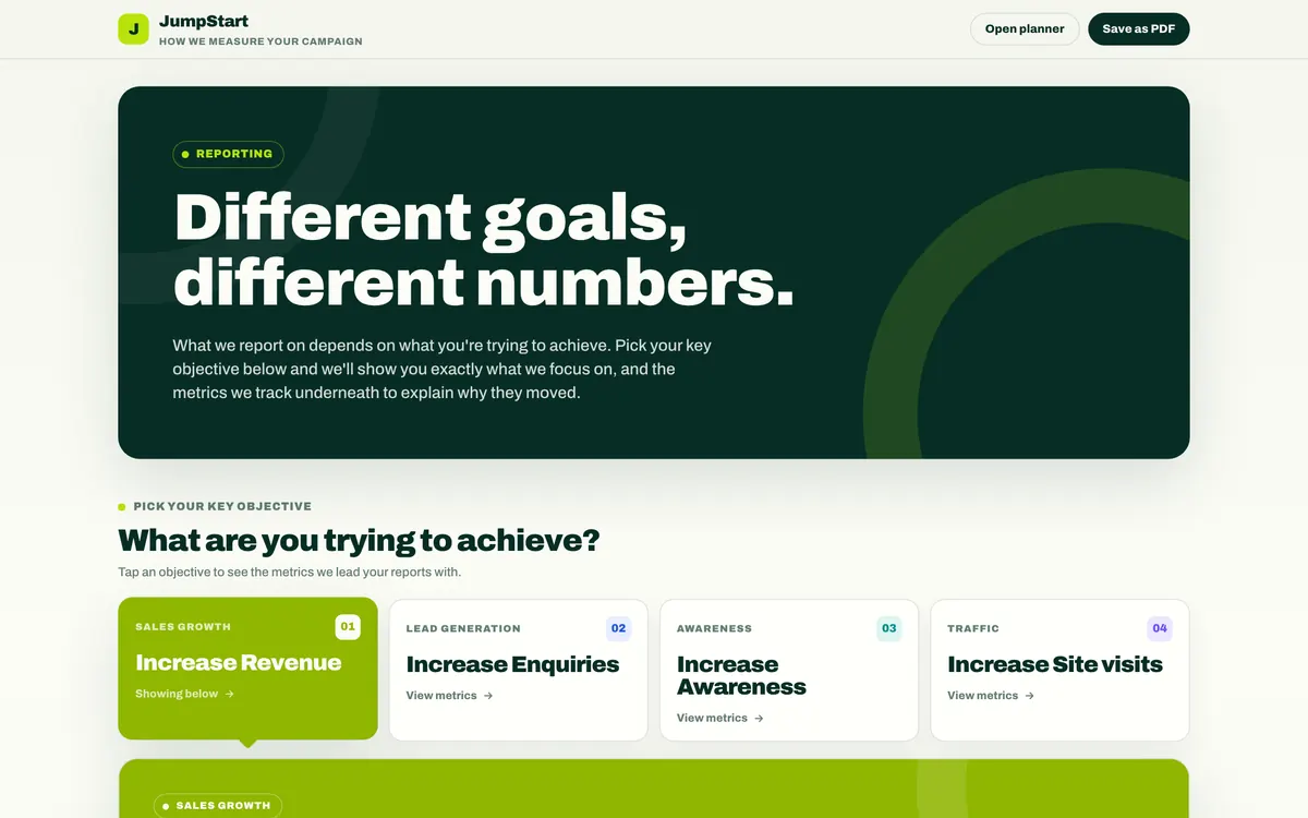
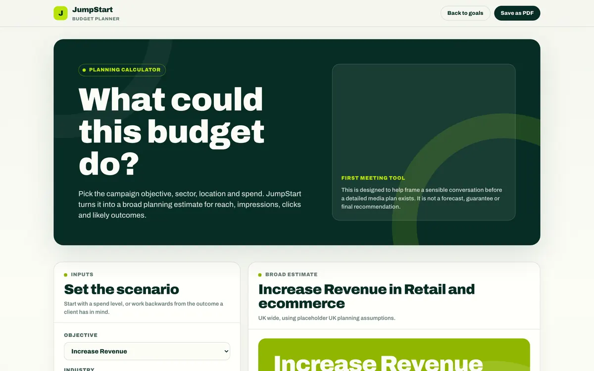
They also wanted help justifying budgets in first meetings. I built a planner that works both ways. Start from the spend, or start from the goal and work back to the spend it needs. V5 became the approved reference at jump-start.app/approved, and later the first version to run on a real client’s data.
July
July was for visual direction. I tried a white editorial version, warm paper, a navy and orange brand, a lime bolt, a museum painting behind the numbers and a pixel pattern. Some were beautiful. None of them fixed the real problem, which was the order things appear in.
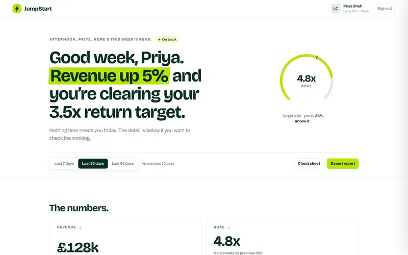
Daylight
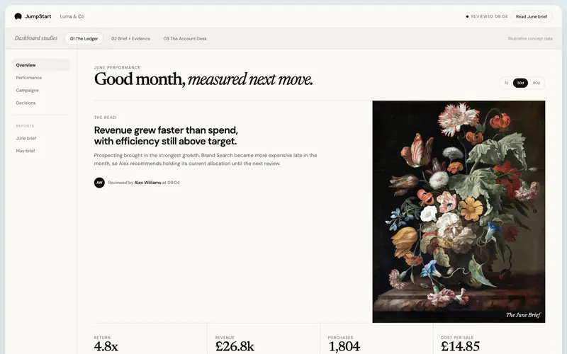
Painting
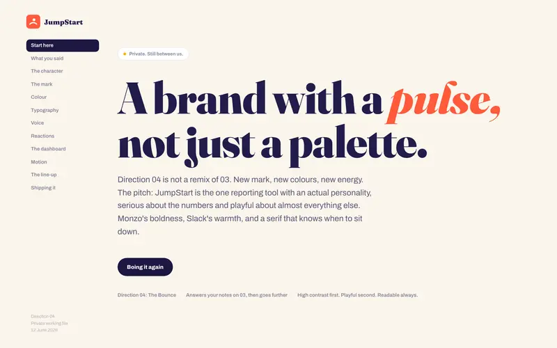
Bounce
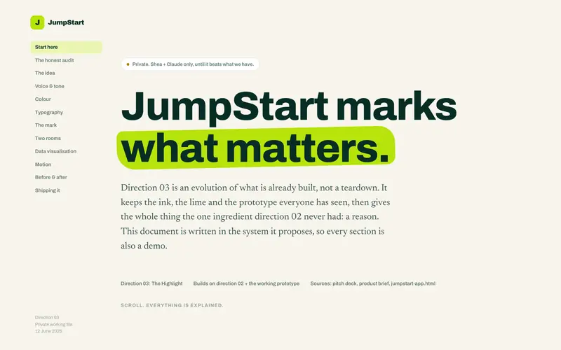
Highlight
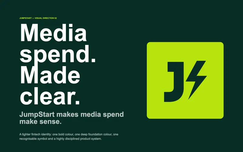
Bolt
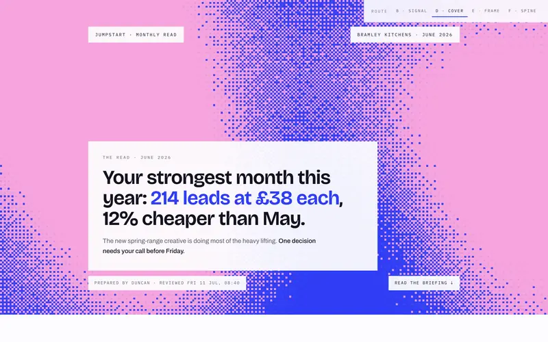
Pixel
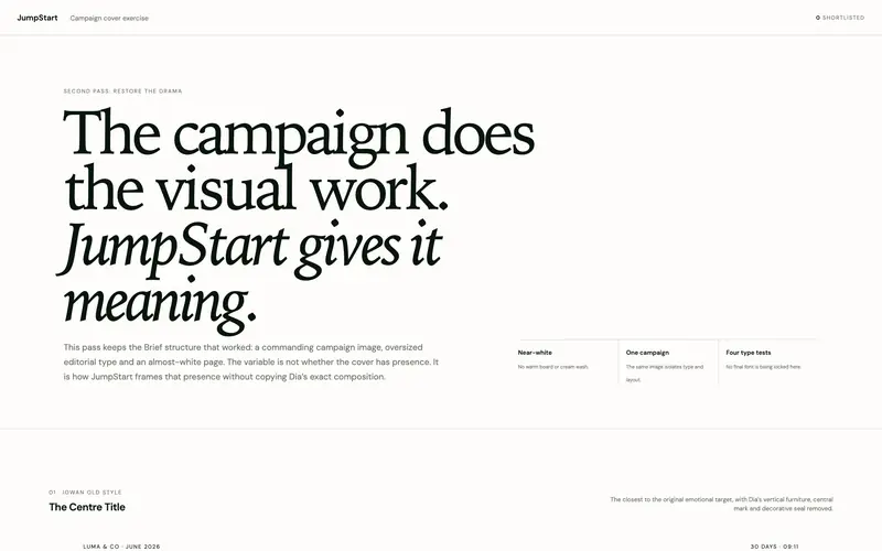
Campaign cover
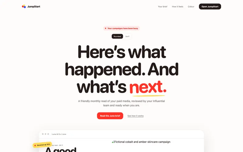
Coral
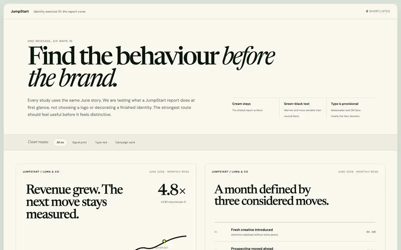
Behaviour first
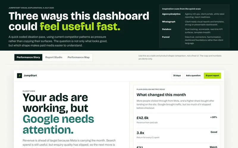
Three directions
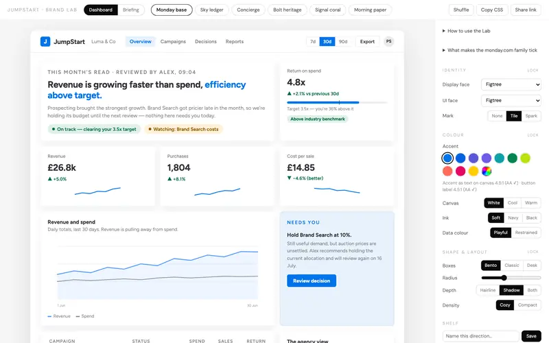
Brand lab
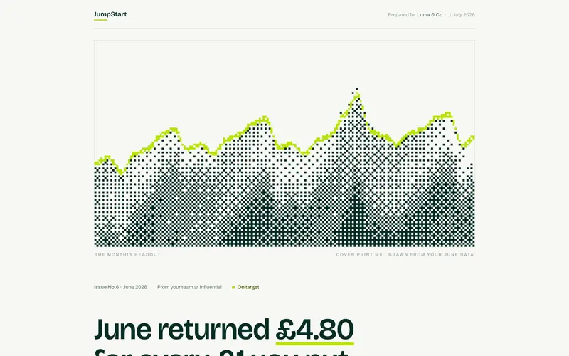
Monthly readout
On 11 July I stopped and went back to first principles. A report should make a claim, show the evidence, then let you inspect it. Most dashboards do it the other way round and leave the client to find the story.
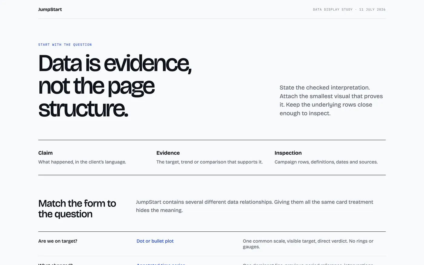
The same week, said two ways
A dashboard saysCPA increased 18% week on week and CTR decreased 7% across Meta prospecting campaigns.
JumpStart saysProspecting got more expensive this week. Weaker click quality on Meta is the cause, so we are cutting the lowest-performing ad set and testing new creative before touching the budget.
A dashboard saysMeta API sync failed.
JumpStart saysMeta data is delayed, so this week’s view is incomplete. Google and Shopify are up to date. We will refresh the Meta figures before this report is shared.
A dashboard saysAll KPIs within expected parameters. No anomalies detected.
JumpStart saysNo action needed. Everything is on track and we are leaving the account alone this week.
“No action needed” became one of the most important states in the product. A short report is proof that someone looked.
21 July to 13 August
On 21 July I connected the National Football Museum’s Meta account to V5. A real campaign in the approved design taught me more than any mockup had. It also showed what we couldn’t honestly say yet. I took out the demo targets, benchmarks, funnel claims and invented action plans, and kept only what Meta reported.
Rules for numbers a client can trust
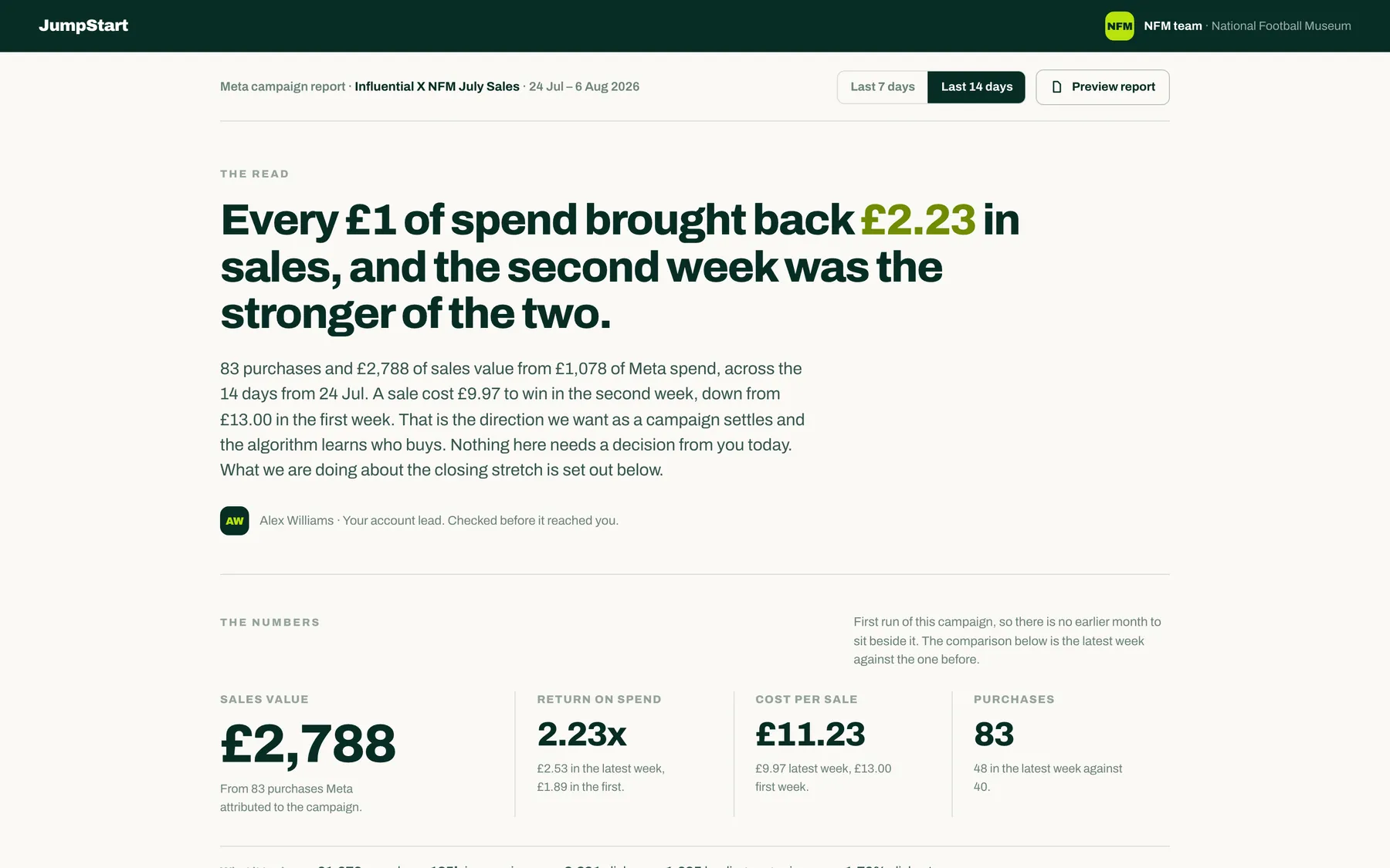
On 13 August the client page went behind a password at jump-start.app/nfm. It got its own release branch, so my design work couldn’t change what the client saw by accident.
20 to 26 August
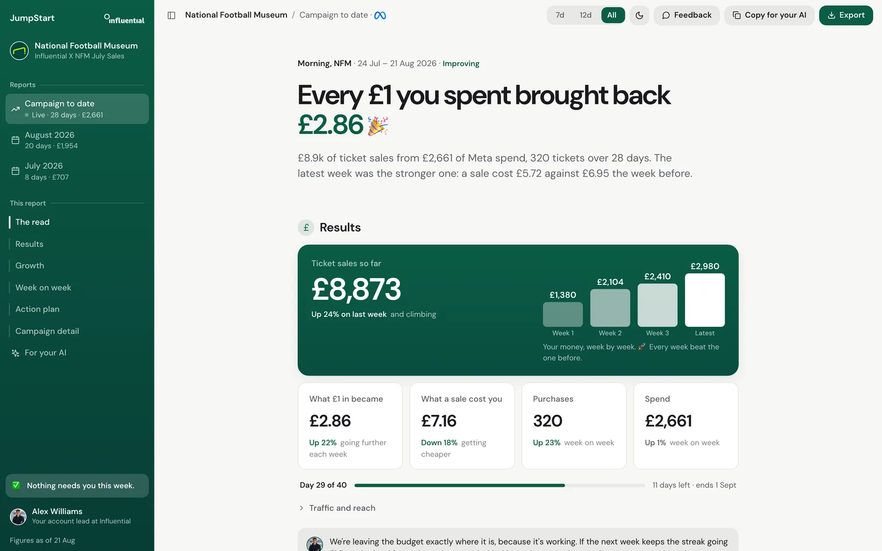
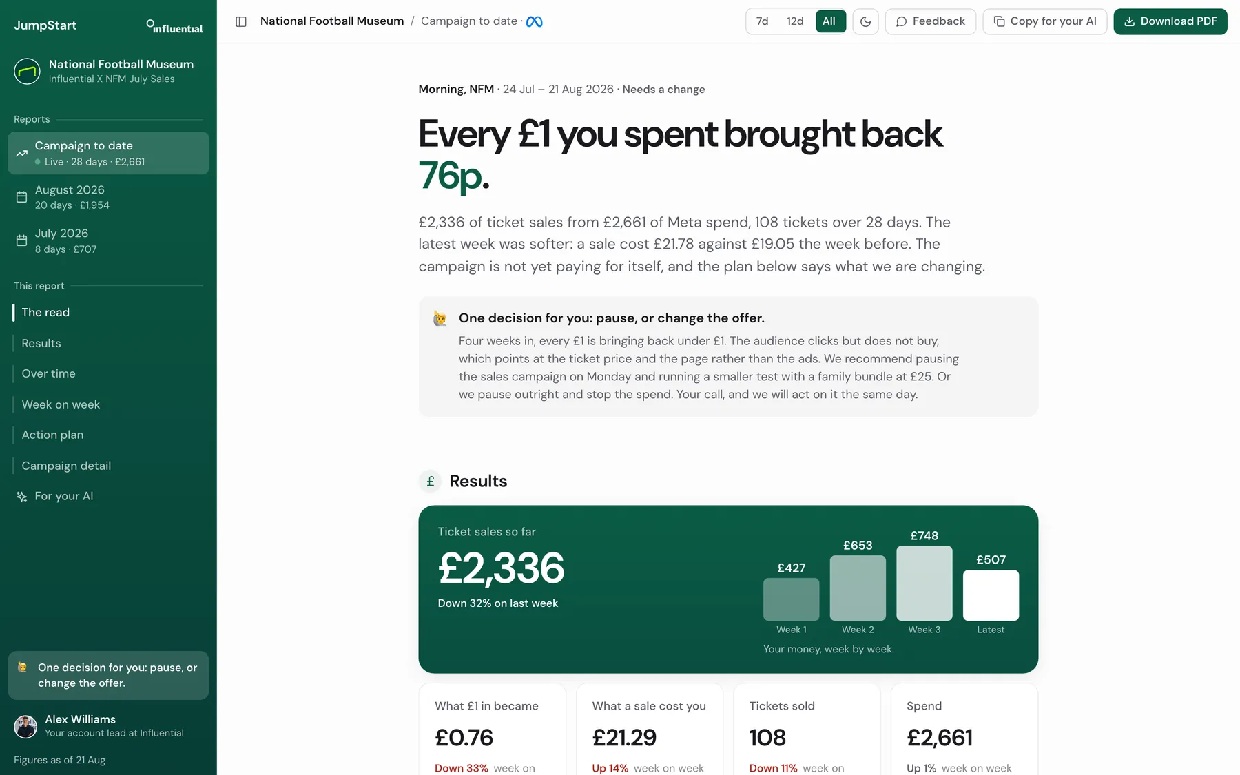
In late August the report became a briefing. It opens with one sentence, “Every £1 you spent brought back £2.86”, says whether anything needs you, and the account lead checks it before it reaches you. The numbers are there to back up the sentence.
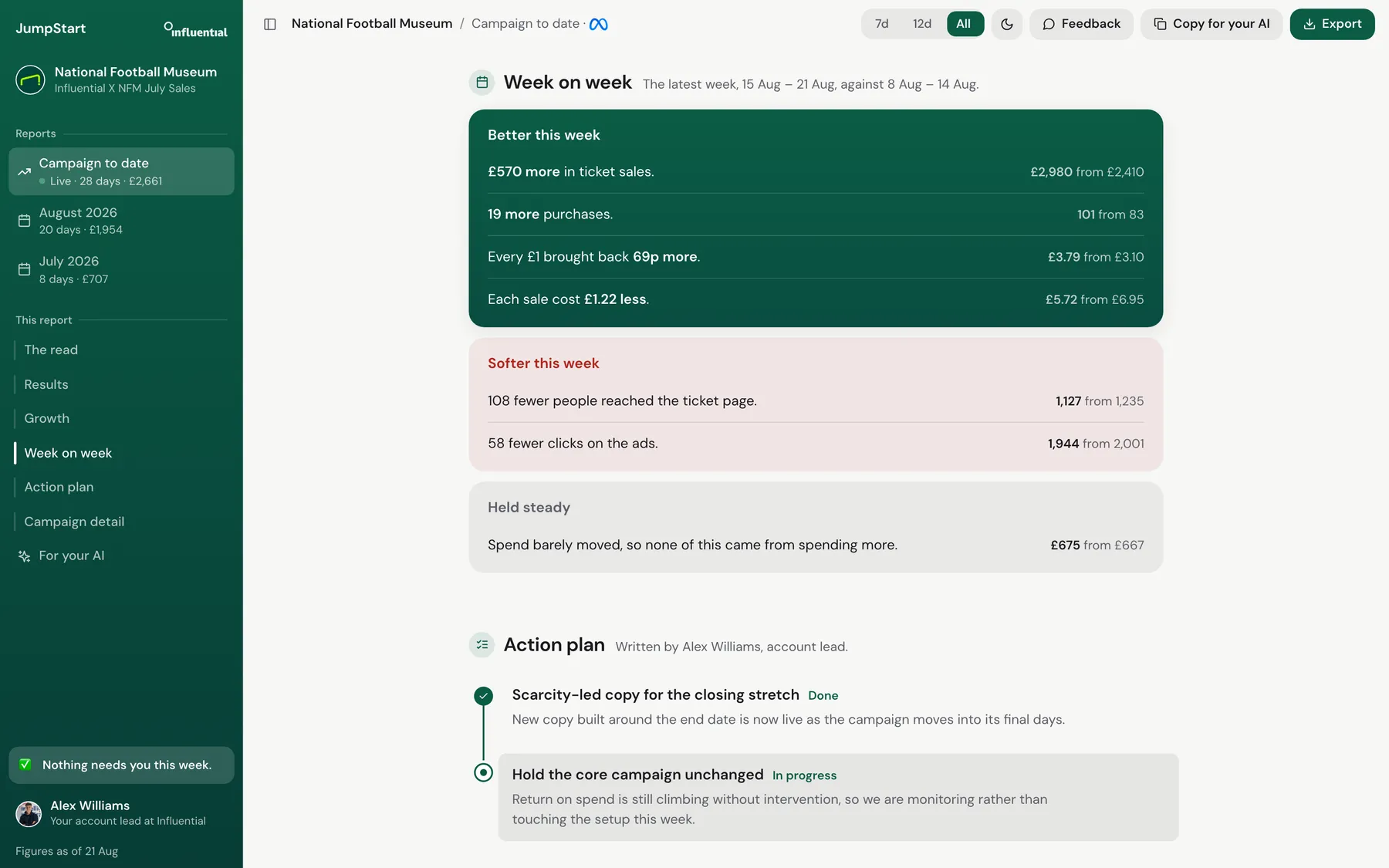
Alex said it still looked complicated next to the Monzo and Slack feel James wanted. My first move was to cut, and I took out the week on week section. That was wrong. The page got emptier and no clearer. I put it back and redesigned it with paired bars, a plain line under each and changes written out, like “Down 8%, getting cheaper”.
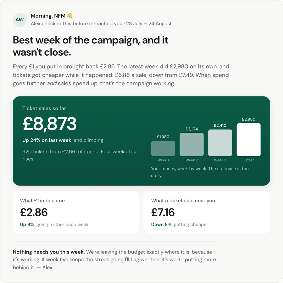
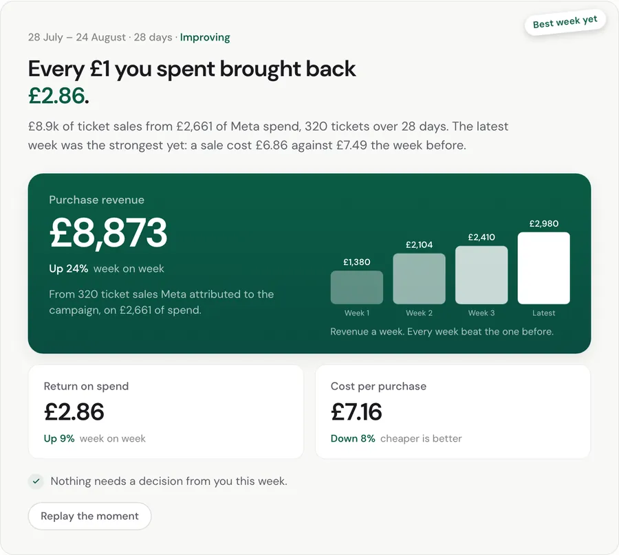
Then I worked on the tone. The briefing was correct but cold, so I built the same report at four temperatures, from plain to handwritten, and judged each one against the last.
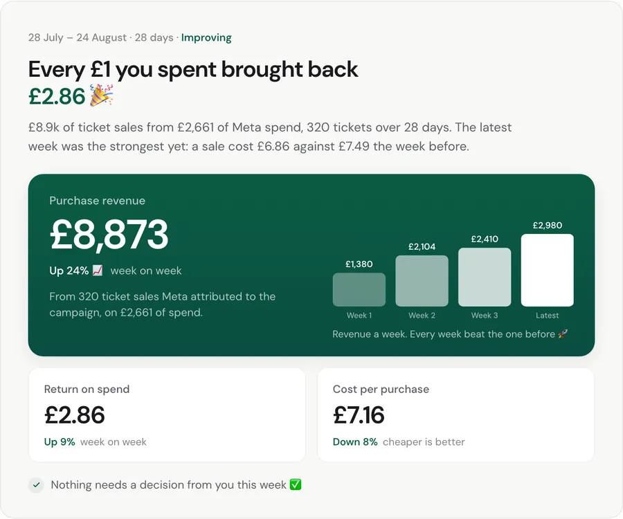
1Emoji as seasoning
2A human voice Shipped
3Celebration motion
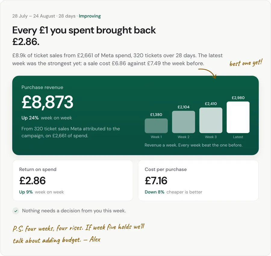
4Annotated by hand
The second one shipped, with the counter from the third. Most of the warmth lived in the words: a greeting, a verdict, a sign-off. These are the rules I kept.
27 August to 4 September
The agency needed its own view. The desk opens with what needs a person: broken things first, then decisions, then reports waiting to be signed. “1 connection down, and 4 other things for a person.” Anything that’s fine stays out of the way.
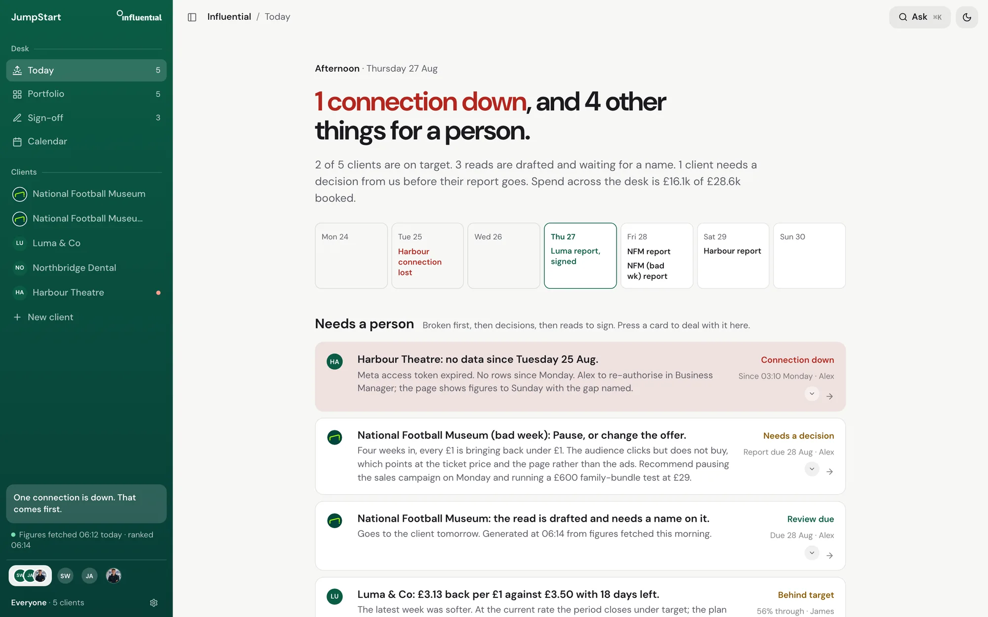
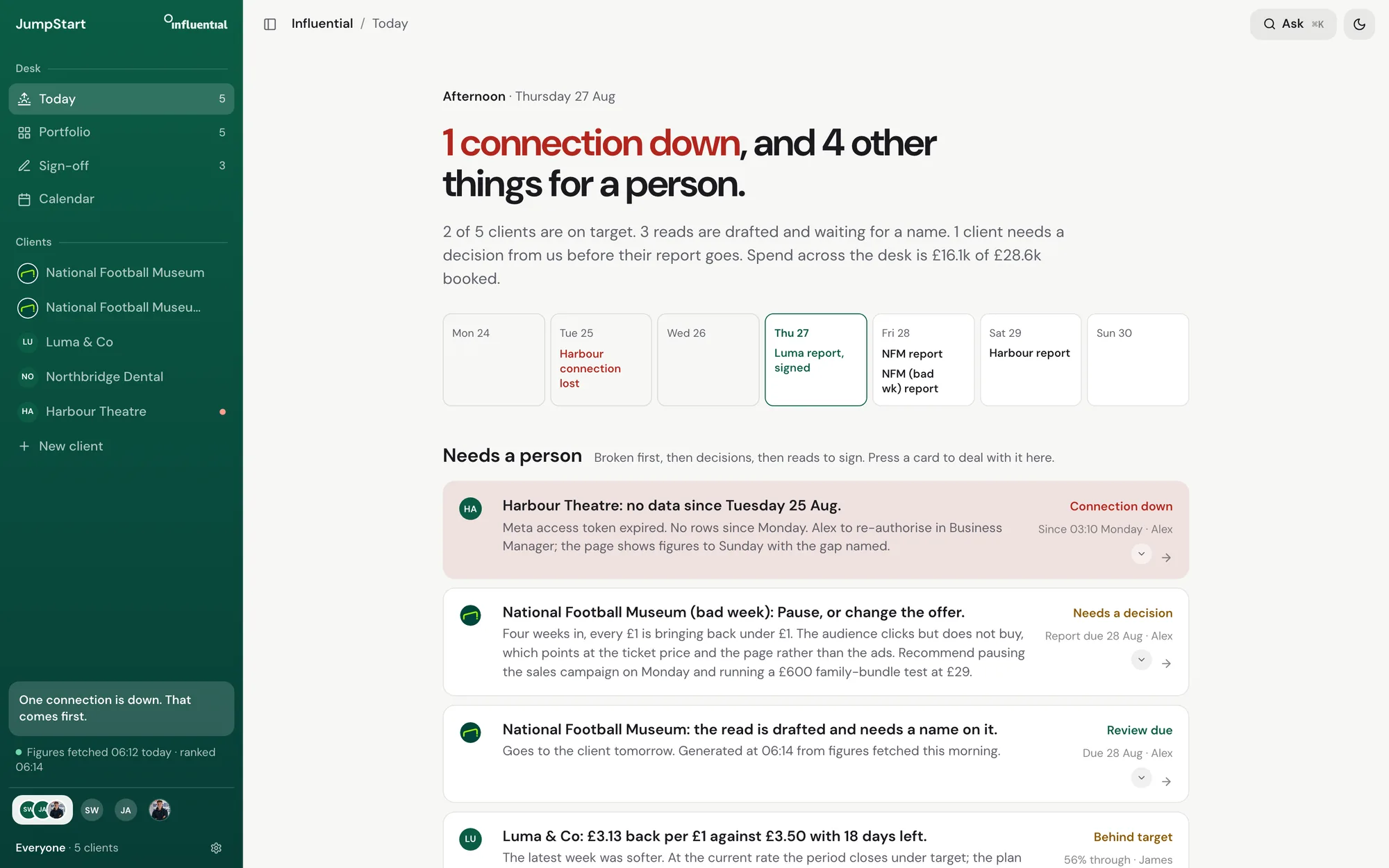
Two details show how I work. I tried eight sounds for the desk and kept three. The three I kept had measurable things in common: quiet peaks, a low body under the click, nothing high for long. So I wrote those down as rules, and a test now checks every new sound against them.
The logo lockup got the same treatment. A mark next to the JumpStart wordmark is aligned from two numbers measured off its own file, instead of being nudged until it looks right.
September
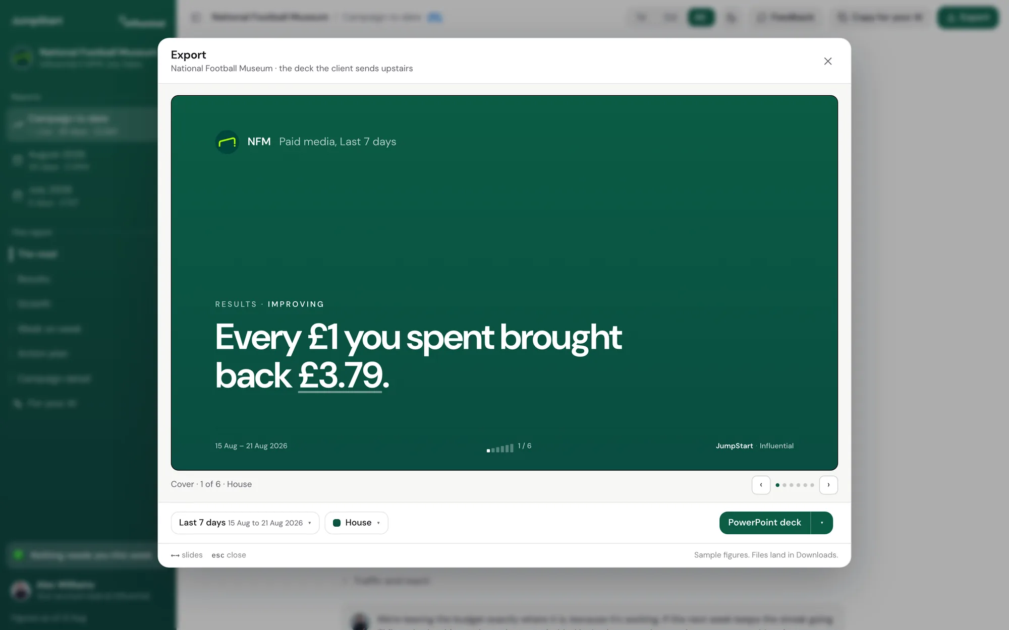
Clients forward reports to their boss, so the export matters as much as the page. One dialog serves the client and the agency. Pick any two dates, see the deck before it goes, then send it as a PowerPoint deck, a PDF of the deck, a full A4 report or an email. It remembers each client’s style: House, Night or Dawn. Until a person signs a report off, JumpStart stamps it as a draft.
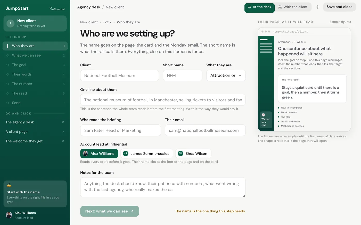
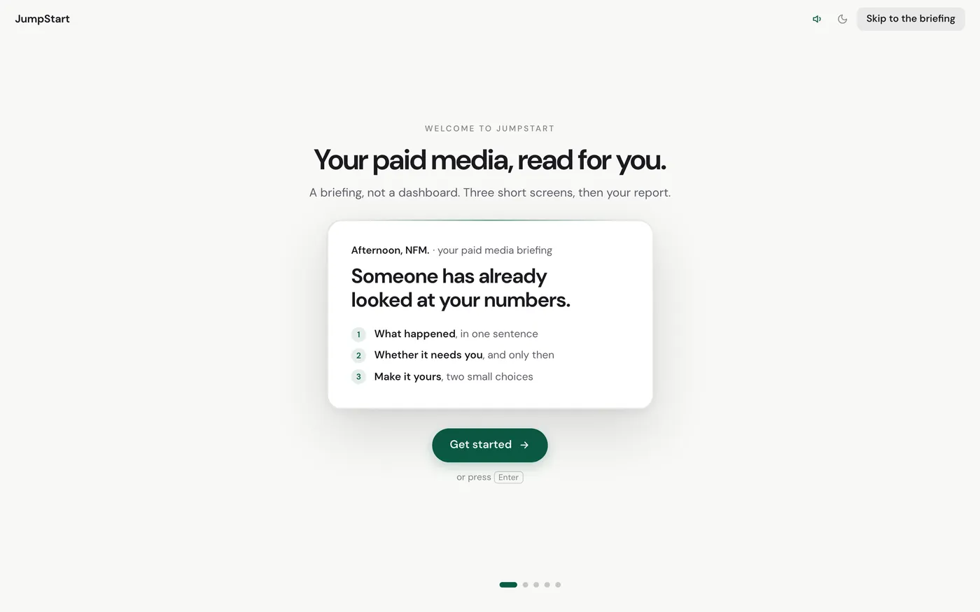
First use got the same care. The agency sets a client up in seven steps. The client gets a short welcome that explains the briefing before they see their numbers.
Most of the feedback came from James and Alex, in reviews and on Slack. I’ve paraphrased it from my notes.
9 JuneJames
Reporting tools are clunky and too heavy on data. It should feel like Monzo or Slack.
A plain-English read at the top of every report.
JuneAlex
The client should never need a call to understand their report.
Explainers on every number, “what we’re doing next”, and client questions that reach a person.
25 JuneJames and Alex
Our own benchmarks could make us look bad against the wrong sector. Red should mean broken.
Industry benchmarks, strict colour rules and no rings.
6 AugustAlex
I need purchases, revenue and return on spend for this one campaign.
Reporting scoped by campaign ID, with every Meta label mapped by hand.
13 AugustAlex
Hide the plumbing from the client.
Campaign IDs, the live-data pill and the mock chat came out.
25 AugustAlex
It still looks complicated.
I cut too much at first, then rebuilt week on week properly.
28 AugustAlex
“Tickets sold” should say “Purchases”.
Renamed, with a note on order value.
When a page looks complicated, the fix is usually the order and the wording. Taking things away just made it emptier.
The first live campaign removed more bad ideas than any review did.
Principles, sound rules and measured lockups meant the next version argued from a rule instead of from adjectives.
With AI I could build a whole direction in an afternoon and throw it away. Knowing which one was right was still on me.
What’s next
JumpStart is still in development, so these screens will change. Next, it keeps a record of every decision: what JumpStart suggested, how the account lead changed it, what the client said and what happened after. The ad platforms don’t have that, and it’s what will make the suggestions better. The name might change too.
Next project
Type or talk, and it sorts the lot into tasks, routines, ideas and projects.